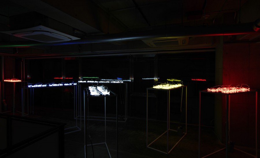
Installation view of Gallery PARC, Kyoto.
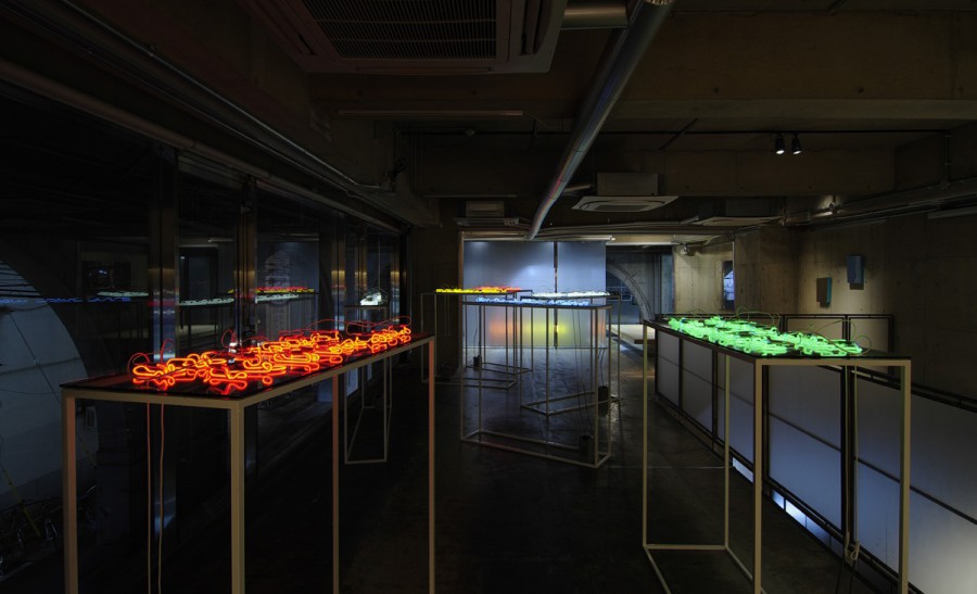
Installation view of Gallery PARC, Kyoto.
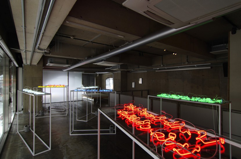
Installation view of Gallery PARC, Kyoto.
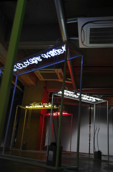
Installation view of Gallery PARC, Kyoto.
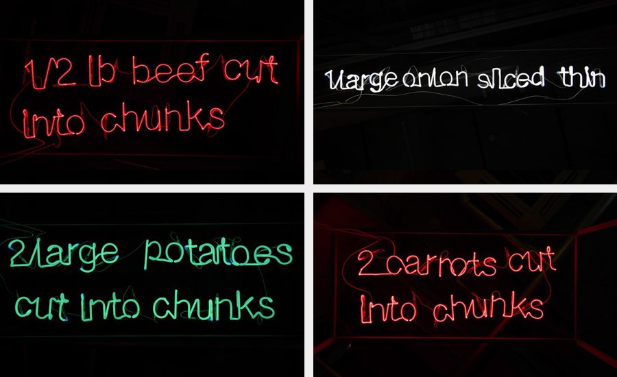
Installation view of Gallery PARC, Kyoto.
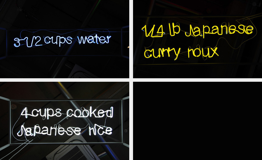
Installation view of Gallery PARC, Kyoto.
《Untitled(Recipe #1)》could be Takashi Kunitani’s representative work.
Recipes must be for everybody. A recipe understandable to Mr./Mrs. A, but not for Mr./Mrs. B is a failure. The word ‘recipe’ came from ‘medicine recipe’, deriving from the “recipient” who ordered its preparation. It is therefore far from literary decor and should be simple and clear. In addition, recipes use common nouns. It is entirely feasible that the conditions of the occasion and the place may not be the same, so recipes are also concrete and abstract at the same time. Carrot A and carrot B are replaceable. Meals cooked with the same recipe are equally called the same name regardless of their success or failure. ‘Recipe’ is a message without deviation; it is pure and strong.
Takashi Kunitani exhibited a work using a string-shaped neon bulb at his solo exhibition at GALLRY PARC in 2011. It was luminous (bright yellow) and placed at eye-level. In addition, the work was placed so that the side of the letters was exposed; not the familiar letter faces we know. By crouching slightly, one could read, “Mars is not yellow” through the glass in the top panel. The string of letter figures was similar to script. Mars, derived from Martian, is red as an astral body; it is certainly not yellow, make no mistake. Moreover, this is not a secret that needs to be kept dark. This refers to two points; Mars is not yellow & Kunitani’s artwork is shaped like a string of letters. The reason why I am writing this is to emphasize that these two seemingly secret points are not actually secrets. The catharsis of the charade was taken away from the very beginning.
The luminous string artwork was also exhibited at the Kyoto Art Center in 2012. The color of the lights was a tricolor of red, white and blue, probably because the exhibition was a part of ‘Nuit Blanche’– a French festival for white night. By crouching, one was able to read Red, White and Blue in order. One can consider the reason behind the use of English words in tricolor at the French event to be Kunitani’s sense of humor, but I prefer to think that he chose English just because it is the most versatile and neutral language. The choice of a universal typeface is one basis for this judgment. Self-referential tautology increases the strength of nonsense when it loses its own tough context. Again, the string-shaped illuminant object pretends to hide the aspect of letters to the audience, but there is no hidden message. Everybody knows it is in red, white and blue at first sight. I must meanwhile confess that I cannot remember if it was Red, White and Blue or, red, white, blue or, RED, WHITE, BLUE. And, the same goes for the order of the tricolor. It made me read first rather than see. Reading by language clouds our vision.
There is no secret in Kunitani’s new work, entitled “Recipe.” This fact is rather surprising. If you don’t mind crouching, the content that the neon bulbs convey to us is clear. It’s a cooking recipe. If I repeat my earlier maundering I would say, “recipe is as metaphysical as the Word of God”—and that is what I would like to say now after seeing Kunitani’s new work.
The words function in Kunitani’s work, but these functions are nullified. It seems natural to recall the works of Magritte and Jiro Takamatsu. However, I would rather consider these words in Kunitani’s work as a certain type of spark from God. What if I compare it with Rembrandt’s “Belshazzar’s Feast” (the National Gallery, London, about 1636-8)?
The work of Rembrandt depicts the story in the Old Testament, Book of Daniel (5). When Belshazzar, King of Babylon, was holding a banquet with the loot taken from Jerusalem, a divine hand appeared suddenly in the air and wrote luminous Hebrew characters. Belshazzar was awed and let Daniel (a prophet and captive) decipher it, as no one there was able to read it. Daniel criticized Belshazzar’s sacrilegiousness and explained the luminous characters were a sign of the end of his kingdom. That very night, Belshazzar was slain by an assassin sent by Media.
What the works of Kunitani and Rembrandt have in common are luminous characters. In addition, the people who have contact with them are unable to react properly to the message within. Belshazzar could decipher the message only with the help of the prophet, but he could not avoid his own tragedy. We can read the recipe in the work of Kunitani quite easily, however, we are left alone without understanding as to why the recipe is given. It would be a marvelous misconception if someone considered cooking it accordingly.
Why recipe? What I have been trying to describe all comes down to the fact that this question itself is an entrapment. Kunitani would never have a reason that covers linguistic comprehension, and he shouldn’t. Even so, if we try to think of a satisfying answer, we could say “the volume of the text fits with the exhibition space.” This is a self-dogma; I romanticize the notion of contrast, hoping the basis should be a physical restriction on the presumption that the recipe is a metaphysical text. In his artwork “Drawing,” characters are coincidently transferred to paper on the floor, to cite a case. Or another work “The sole of workboots” makes shoe soles sacred. The innocent malice of Kunitani drags the untouchable world into the material world, and sanctifies the familiar. What about a grid engraved on a mirror? There is a strong resemblance to lying a string-shaped neon tube flat, if we understand it as an image in brackets or a meta-level thinking of other words.
Hyogo Prefectural Museum of Art, Curator, Tadashi Kobayashi
Untitled ( Recipe #1 )
, 2012.Neon tubing, transformer, glass, steel
Dimensions variable.


